
 We toil, we slave, we burn the midnight oil in several different time zones to bring you meaty features (like all our Best of 2014 coverage), instant news reports, big-name interviews, and a multitude of reviews and what thanks do we get? The average ‘Hunger Games’ character poster will get many times the clicks of our labors of love and craft. But before you get out your tiny violins, this year, we’ve decided if we can’t beat the pressures of corporate promotional activity, we’re damn well gonna rank them.
Movies posters can be among the crassest, most blatant, down-and-dirtiest marketing tools available. We die a little inside each time there’s a new hullabaloo over the latest comic book movie teaser which is—inevitably—the title of the movie against a black background looking as though it’s been embossed in brushed steel and/or someone inadvertently firing out a fart explosion. (I mean, we run it, of course, because we’re enormous hypocrites, but we still die a little.)
However, there are those posters that light the way to a brighter future, in which talented artists and designers, inspired by films we have at that point not yet seen, find inspiration to spin something creative in its own right, and develop covetable, framable, exotic, or intriguing imagery. In fact sometimes, the posters can surpass the films they promote.
So we thought it was time we stop carping from the sidelines about the bad stuff and start recognizing and promoting the good stuff. Here then, for the first time ever, is The Playlist’s 20 Favorite Movie Posters Of The Year. Quick note: we’ve tried to be strict in keeping it to posters that were released in 2014, irrespective of the release date of the film, and wherever we can find it, we’ve credited the artist or design house responsible. If you know the designers of any that we couldn’t find, please let us know in the comments.
20. “The Wonders”
The film won’t hit U.S. theaters until next year, but “The Wonders,” Alice Rohrwacher’s German-Italian coming-of-age tale, was one of the biggest crowd-pleasers at Cannes, and its poster was one of the more unforgettable images on the Croisette this year. A simple illustration of a young woman with bees coming out of her mouth (from Italian house Internozero Comunicazione), it evokes both storybooks and surrealist art in a way that initially seems quite different from the film itself, but is actually a perfect fit. As far as we can tell, the film hasn’t yet been picked up for U.S. release, but don’t be surprised to see this covering arthouse walls in 2015.

19. “As Above So Below”
It might be have been yet another found-footage horror picture (albeit one more effective than most), but late-summer-dregs genre quickie “As Above, So Below” had a few things in its favor: a sparky lead performance from Perdita Weeks, a nifty title, and most of all, an ace one-sheet. Utilizing the red-and-black theme that seems so popular this year, it mixes a cannily inverted Eiffel Tower with a mound of skulls (the film is set in the Paris Catacombs) in a hypnotic manner. Who said that great posters had to come out of great movies?

18. “Godzilla”
There were some stunning 2-D graphic takes on Gareth Edwards’ “Godzilla,” (and you may have noticed our fondness for a black, red, and white color scheme elsewhere on this list), but we weren’t 100% certain those were legit commissioned posters. So instead we’ll go with these perhaps more standard photo-real posters from design house Art Machine, which is nonetheless a great example of blockbuster marketing, truly giving us a sense of the scale of the monster. That it also kind of forewarns us that our actual looks at Godzilla will be rationed until late in the film, and then mostly partial, is something we couldn’t have known until after seeing it.

 17. "Gone Girl"
Neil Kellerhouse is one of our favorite designers and he should be one of yours too (just peruse through his site for more striking imagery, including a lot of those Criterion Collection covers you like). If you don’t believe us you should believe tastemaker David Fincher who always has his finger on the pulse of choice visual and sonic aesthetics (Steven Soderbergh is a big champion too). There are lots of great “Gone Girl” posters, but you gotta hand it to the boldness of Kellerhouse’s first one sheet: a puff of smoke floating in front of a lifeless gray background. It’s utterly simple, but tremendously effective, and deftly conveys the mysterious and sinister qualities of this shape-shifting picture. Also kudos to Fincher for having the balls and baller swagger to force through something this vague onto a mainstream movie poster.

16. “Winter Sleep”
Divisive as Nuri Bilge Ceylan’s epic Palme d’Or winner is around these parts, it is at times certainly very beautiful. This one-sheet, a clever mix of Drew Struzan and what looks like rotoscoping, encapsulates that harsh beauty, but also gets at the bookish tone of the film, and the fraught relationship between the central husband and wife, with the snowy wind whipping their hair about as the man hides his face in… shame? Defeat? Exhaustion? The generous wide vista puts the Cathy-and-Heathcliff vibe into context though, something that, arguably, the film, with its tendency for tighter, more claustrophobic interior shots, could use more of.

15. “Foxcatcher”
Striking, haunting, and simple. Posters with the lead characters on them are pretty blasé and typical, and studios usually use one-sheets as a vehicle to slap the actor’s faces up-front and center so you know who the star is in the most obvious way. Subverting that model, this “Foxcatcher” poster designed by the folks at InSync + BemisBalkind features Steve Carell’s deceptively dangerous scion right up front and center, but the rendering of the character—a fractured silhouette meets a jagged shard of broken glass and the empire within—speaks volumes to his disturbed psychological state and the inner torment that will soon be unleashed.

14. “Borgman”
So we’re not picking this one because of the generous quotage of our review it boasts (or at least not only because of that), but because this eye-catching poster for the twisted allegorical satire "Borgman," from Dutch madman Alex van Warmerdam, perfectly encapsulates the sinister, mock-playful, puppet-on-a-string vibe of the film. It also overcomes our own prejudice against posters that feature the lead characters prominently, with the painterly way the image is treated and the carefully controlled browns and grays of the palette contributing to an effect that is more illustrative and evocative than photo-real. Want more? Take a read of artist Brandon Schaefer‘s fascinating explanation of the process leading to the design.  13. “Actress”
We might have been marginally cooler than some on Robert Greene’s exploration-of-identity-and-performance documentary “Actress,” about “The Wire” star Brandy Burre’s attempt to return to performing after a decade as a wife and mother, but we can certainly agree that the film’s poster (painted by Laura Baran, designed by Therese Berens) was one of the finest of the year. Making explicit the film’s nods to classic melodrama, it’s a beautifully executed evocation of classic Hollywood crossed with pulp fiction paperback that you could see adorning the wall of Douglas Sirk back in the day. 12. “The Babadook”
Some of the best poster designs keep it wonderfully minimal, with a single image conveying volumes of emotion. One of the greatest examples of this effect (along with a few others on this list) is The Solid State-designed poster for Jennifer Kent’s fantastic feature debut “The Babadook.” Just like the film itself, this design stays away from the usual busybody horror posters that try to shock you or gross you into watching, and it just has the dark drawing of the titular monster splashed in the middle of a beige background. A creepy black void, with an outline a child could’ve drawn (or a grown up remembering a childhood monster), it invites the viewer through intrigue, not schlock.
 11. “The Guest”
Adam Wingard’s pulpy blast of fun, "The Guest"—a genre-twisting, 1980s action throwback starring “Downton Abbey” star Dan Stevens, of all people—had an impressive command of its slick, retro atmosphere and mood throughout, and that extended to its marketing campaign. There was some strong work across the board as far as posters went, but it was the earliest teaser, an ’80s-style Vice City silhouette of a young lady with a gun designed by Blood & Chocolate that most caught our eye: simple, evocative, and attention-grabbing.

10. “A Girl Walks Home Alone At Night”
Playlisters have gradually been falling for Ana Lily Amirpour’s Iranian-set, California-shot, black-and-white vampire tale “A Girl Walks Home Alone At Night” ever since Sundance. If you’re not convinced by the glowing reviews, the film’s key-art might convince you: an immediately iconic black-and-white-and-red image by Michael DeWeese of a hijab-wearing bloodsucker, which immediately evokes the imagery of everything from “Nosferatu” to “Let The Right One In,” while also showing that it’s not going to be the same ‘ol same ‘ol. And it’s all put together in a haunting style by Kino Lorber’s Art Director, Emily Suber.

9. “Listen Up Philip”
While we love the warm illustration style (by Anna Bak-Kvapil), the campaign for Alex Ross Perry’s “Listen Up Philip” is really about the absolutely inspired typeface choice, which evokes perfectly a 1970s Philip Roth novel’s hardcover dustjacket. In fact, the font and other design elements (put together by polymath Teddy Blanks of CHIPS design studio) form the centerpiece of the rest of the campaign, with even the simple black type on purple background version working to give that incredibly specific, very apropos, retro bookish vibe. Bak-Kvapil and Blanks also created all the fictional book covers in the film.

 8. “Red Army”
In similar vein to the also excellent “The Interview” poster, it seems designers internally punch the air when the film they’re illustrating has a communist or soviet theme. U.K. design studio La Boca is behind this Soviet propaganda-inspired take on Gabe Polsky’s hockey documentary, "Red Army," mining a bygone era in which communist ideology was glorified in such a graphic, striking aesthetic, and turning out multiple executions of the kind of artwork that becomes covetable all by itself, outside the context of the film.

7. “Under The Skin”
If we had to choose, our hearts would go with the iconic, ethereal image of Scarlett Johansson that was the main poster for "Under The Skin," but that artwork, from design genius Neil Kellerhouse, actually did the rounds in 2013. This follow-up, however, is pretty striking in itself and a ballsy, go-for-broke move by A24’s marketing team. It’s as if they’re declaring: here’s our film, it’s weird, it’ll creep you out, deal with it. In a film littered with unsettling images, the empty skin-suit is one of the most outright grotesque, yet pictured here it remains ghostly—the same line between horror and haunting the film walks so brilliantly.


6. “Nightcrawler”
“The city shines brightest at night” reads the tagline for Dan Gilroy’s psycho-noir dissection of the belly of the beast known as news reporting, “Nightcrawler.” It shines even brighter when reflected and filtered through the sunglasses of Jake Gyllenhaal’s Lou Bloom, the man who sees the world for what it is and exploits it with the steely gaze shown on the BLT Communications-designed one-sheet. Sure, he cracks a demented smile once in a while, but this simple, nonchalant expression that covers the entirety of this pulpy design tells you much of what this film is about in the simplest of ways: this dude ain’t normal. So simple, down to the dotty, newsprint-style pulpiness of the image, and yet so slick.
 5. “The Double”
It’s hard to find a marketing tool in the form of a single poster as captivating as this sketched ad for Richard Ayoade’s “The Double.” Designed by Empire Design, the one sheet sees Jesse Eisenberg’s face split by the title, which is appropriately disorienting, but this one, with its reflector from the concrete tower of cascading buildings shining its light on the lonely hero, is worth a thousand words. It immediately brings to mind the crossbreeding of Ayoade’s influences, Kafka, Gilliam, and Jacques Tati, and markets the film exactly for what it is at its core: one man’s entrapment against a looming bureaucratic tower of endless hell. All of that, without even relying on its doppelganger concept.
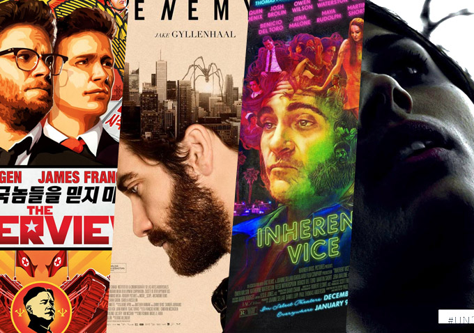
 4. “The Interview”
It’ll probably be remembered best as the movie that caused an international incident, and (perhaps) brought a major studio to its knees, but one can only hope that the Sony marketing folks who came up with the poster for “The Interview” (along with deisgn house Ignition) have been spared too many embarrassing email leaks, because it’s terrific work. A borderline psychedelic take on North Korean propaganda, with Seth Rogen and James Franco front-and-center, it includes some sly in-jokes (“Do not trust stupid Americans!,” reads the Korean text under the stars’ names), and still manages to be curiously beautiful. 3. “Inherent Vice”
“Groovy.” The word is threatening to go out of style faster than it came back in thanks to “Inherent Vice,” but how otherwise uncategorizable is the hazy world Paul Thomas Anderson has created with his adaptation of Thomas Pynchon’s novel? But it’s a word you can scarcely avoid when you pick a poster, any poster, from the film’s marketing campaign, designed by Dustin Stanton. Whether it’s the legs chilling by the beach with a sunset of possibilities sailing on the horizon, the Last Supper of munchies with the whole entourage, or various characters growing out of Joaquin Phoenix’s hair as he stares defocused and groggy into the middle distance—these poster designs are the perfect marriage of green and purple kush. Real groovy.


 2. “Birdman”
Given that the film was far from the easiest sell, one has to applaud Fox Searchlight’s campaign for “Birdman,” which has been strong from the start. The film’s one-sheet, via BLT Communications, who are also behind the "Nightcrawler" poster, with a painting of Michael Keaton with his superheroic alter ego perched on his head, was strong, but it’s how well the style extends into the series of city-themed posters (designed in-house by Fox Searchlight), done in a gorgeously minimalistic art deco manner (not dissimilar to the “Black Swan” posters from a few years back) that is the real triumph, with one, some, or all of them instantly demanding a place on your wall.


 1. “Enemy”
Appropriately for a mind-bender like Denis Villeneuve’s underseen “Enemy,” the marketing campaign came up with a number of uneasy, haunting images that might not have made the movie a big hit, but did at least beautifully reflect the film and its themes. From the red-and-black number with multiple Jake Gyllenhaals, the simple image of a key with the spider (a motif that literally scuttles around the film), or the main (atypical) poster, with Gyllenhaal’s brain replaced with a city and another pesky spider, it was a hugely creative, eclectic, but always aesthetically pleasing campaign, much of it debuting in 2013. However, our favorite of all was the 2014 stripped-down yellow poster with the dissolving faces designed by Jay Shaw—we think it will stand the test of time just as well as the classic ’70s Polish movie artwork it evokes.


Best 2013 Poster for a 2014 Film
“Nymphomaniac”
This is in fact our inaugural Best Posters of the Year feature, but had we run one last year, there’s no doubt what would have ended up at number one. The poster for Lars Von Trier’s “Nymphomaniac” appeared first late in 2013 and the panel of stars caught mid-O-face was instantly iconic. Designed by The Einstein Couple, photographed by Caspar Sejersen, the “Nymphomaniac” campaign encompassed many different elements—the terrific solo posters, the clever use of parentheses—but the panel poster will surely be a contender for the most memorable of the decade in a few years’ time.
 Honorable Mentions
It’s even more subjective than usual, this list, and we’ll also admit there were a few films whose posters we liked but weren’t really sure we didn’t want to give the spot to a more deserving movie. So “Men, Women and Children” came close, “Kingsman: The Secret Service” and “Kill the Messenger” too, along with “Bad Words,” “Horns,” and, though we kinda poked fun at them in the intro, some of the stuff for the most recent ‘Hunger Games’ movie has pushed the envelope a little and deserves to be commended for that at least. Conversely, there were a few cases where we felt the posters had simply grown on us because we like the film, so “Boyhood,” “The One I Love,” and “Blue Ruin” also are relegated to quick shout-outs.
Any movie poster eye candy we missed out and you want to tell us about? Call it out in the comments, and meantime, you can check out all our Best of 2014 coverage to date here. — Jessica Kiang, Oli Lyttelton, Rodrigo Perez, Nik Grozdanovic, Erik McClanahan