15. “Greta”
The schlocky, deliciously entertaining B-movie violence of “Greta” is the kind that usually has posters framing the two main fighters as variations on vintage video game characters – cheesy, completely unstylish, Paint-esque feats. But BOND’s curious offering opts for simplicity. There’s no literal fishing in the film, but the swinging green handbag on a giant fishhook offers the perfect tease of the rabbit hole-chain of events for Frances McCullen (Chloe Grace Moretz) falls into. There’s another variation, designed by P+A, that still maintains the butter-yellow background, but here offers a diagonal split between the two women. Greta, Isabelle Huppert’s unhinged character, has the right side of her head diagonally sliced – out of which Moretz stands and looks on. One is afraid, the other isn’t. It’s got a storybook-like beauty to it, all prim and clean with the paintbrush strokes. It’s chic, which is why it’s unsettling. – EK


14. “Marriage Story”
To capture the true essence of one ending marriage, there are two sides to the story that needs to be told. “Marriage Story” spends most of its runtime sharing time between Charlie and Nicole, he the impulsive theatre director, a New Yorker through and through, she a sensitive stage actress, living with Charlie in New York but edging ever closer back to her home, and potential future, in LA. This split, turning one whole into two profiles, is perfectly visualized in the film’s posters: there’s complementarity in the colors (and a relieving avoidance of pink for the background of Nicole’s poster, despite Charlie’s being blue) as well as the silhouette of each person, filled with a cityscape of their own battleground. Noah Baumbach thrives on the rawness of his characters’ conversations and the simplicity of their true feelings – which is why the straightforward nature of his very first marketing tools work so well. – EK


13. “Once Upon A Time In Hollywood”
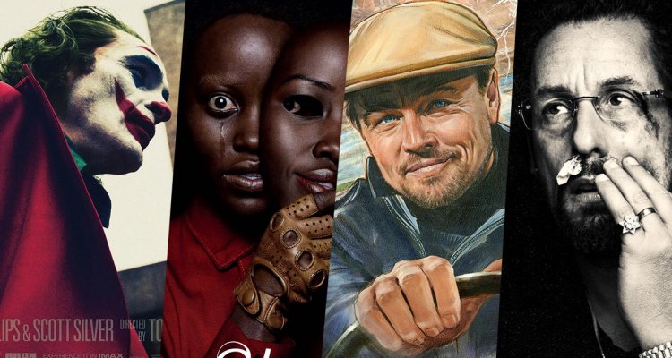
Given its loveletter-to-Hollywood qualities, it’s no surprise that the posters for Quentin Tarantino’s “Once Upon A Time In Hollywood”—at least the non-generic Photoshopped ones featuring the actors leaning up against invisible walls—were illustrated and bathed in a nostalgic glow and warmth, with vintage, throw-back elements of collage pointing towards the ‘60s heyday the film so romanticized (drawn by Steven Chorney). But this being Tarantino, there was an extra meta element of fun to play with the films-within-the-films that the filmmaker did not disappoint with. Chorney also painted several posters for the fake films within ‘Hollywood’ including the fictional film “Operazione Dyn-o-mite” staring Rick Dalton and “Uccidimi Subito Disse Il Ringo, Gringo” also featuring Leonardo DiCaprio’s Dalton. Not unlike the fake movie posters of “Inglourious Basterds,” a few years earlier, these playful, spirited posters, best capture the spirit of Tarantino’s ode to Hollywood, bygone eras of cinema, and the Italian Spaghetti Western and Euro knock-offs he obviously has so much affection for. – RP

12. “In Fabric”
The killer in the red dress. U.K. filmmaker Peter Strickland is an oddball filmmaker. He makes deeply, obscuro films for the cinephile that loves and or can appreciate the nostalgia for ‘60s and ‘70s B-movies, exploitation films, Italian Giallo horror, and titillating softcore Eurotica. He and Tarantino may have lots to talk about with their love for esoteric genre, but Strickland, seems to fixate on the transgressive, strange, fantastical and outre mondo shit that came out of Europe in the psychedelic ‘60s and 70s. His latest, “In Fabric,” is another variation on this mode, this time applying English, kitchen-sink realism aesthetics and grafting them onto his ideas of ethereal, surreal horror. Ergo, you get “In Fabric,” a movie about an eerie department store that contains a cursed dress that basically murders all those who dare to wear it. The conceit is very silly, and the movie is very absurdist, but it wouldn’t be Strickland if the movie wasn’t also deeply hypnotic, and unsettlingly bizarre. This ghostly one-sheet, simple, minimalist and hauntingly effective is an arrestingly evocative image of all the eccentric and outlandish things in store for you in Strickland’s wonderfully spooky movie. – RP
11. “Wounds”
Whether Babak Anvari’s mythological body horror works narratively is an entire debate, probably best kept to the dark corners of Reddit. What can be agreed on, however, is the hallucinatory poster that initially teased it at Sundance – reeling us in more than we would have liked. There’s Armie Hammer, moving on from his usual brood to properly scream, while whatever threat is creeping through the phone distorts his entire brain and being. It’s stylish, with menacing magenta and some kind of subtle grain across the whole picture. But once you dive properly into the gaping orb of the title’s second letter – “Wounds,” somewhat regrettably, takes on a whole new flavor to its initial elusive sophistication. – EK


