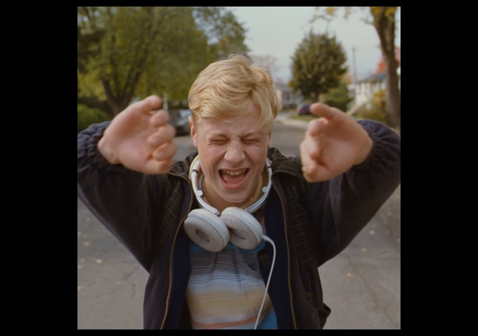
 The framing of any particular film is arguably the defining point of how one chooses to experience cinema. That is to say, the frame both highlights exactly what the viewer is seeing, as well as forces a focus on the content itself by its visual constriction to a set of pre-existing boundaries. Whether a director employs a wide frame with which to better capture a sense of spectacle and awe, or uses a boxed-in frame to take a viewer on a journey into the past, is of no consequence: every decision made in regards to a film’s framing is deliberate.
In the past few years, a number of films have made use of unconventional framing techniques in order to create new ways of experiencing cinema. In a new video essay courtesy of De Filmkrant titled “Cutting the Edge: Freedom in Framing,” we get to take an in-depth look at just what goes into the framing of a scene, or in fact an entire film —as the video calls it, it’s “the box we tell our stories in.”
As the narrator explains, techniques for framing haven’t changed much in the years since the inception of cinema. The examples that the video chooses to highlight, however, are telling. Xavier Dolan has made inventive and certainly audacious stylistic choices with his preference of aspect ratio, particularly in the wide, painful frames of his psychodrama “Tom at the Farm” and the expanding and retracting borders of his fevered “Mommy.” Wes Anderson‘s “The Grand Budapest Hotel,” which used three different aspect ratios to tell a sprawling, layered narrative splintered into three different time periods, is also a notable example (as is, oddly enough, Sam Raimi’s garish and widely-maligned “Oz the Great and Powerful”). Granted, there are probably other examples not shown here that should be, but this is as good a place to start as any. Watch the video below.

