
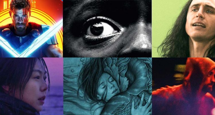
December is here, and that only means one thing at Playlist HQ: just a month to go until the release of that horse soldier movie. But if it meant two things, it would be that it begins our annual binge-look at the year in film and TV gone by. Over the coming weeks between now and New Year’s Eve, we’ll be examining 2017 in cinematic entertainment from every angle, from our least favorite movies to the best in the small-screen, and even looking forward to what’s to come.
Today, we kick off appropriately with often the first thing that any of us see of a movie: the poster. The humble one-sheet might be a marketing tool first and foremost, but over the years it’s become an artform in and of itself, and few of us reading this site won’t have some kind of iconic movie artwork on their wall, be it “Jaws,” “The Godfather,” “Alien,” “Scarface” or that movie where George C. Scott unwittingly trains a dolphin to kill the president.
Your average studio poster might have become increasingly generic in its reliance on floating heads and/or some guy viewed from behind, but there’s still an awful lot of creativity being put to use in teases, alt-posters and sometimes even main campaigns, especially with a number of upstart distributors thinking outside the box.
Below you’ll find our 20 favorites of the year — the only rule we set down was that it had to be used officially in the marketing campaign in some way (rather than Mondo alternates or the like), and unveiled at some point over the last year (some early 2017 movies had posters revealed late last year and made our previous list). Take a look underneath and on the following pages, and let us know which posters you’ve found frame-worthy in 2017.
Click here for our full coverage of the best of 2017.
20. “Roman J. Israel, Esq.”
It’s not hard to sell a new Denzel Washington movie. The two-time Oscar-winning heavyweight actor is one of the last legitimately bankable A-list Hollywood stars. You can promote a movie based solely on Denzel Washington’s involvement, because when audiences see Washington’s face, they know they can expect the goods. And what’s so fascinating about this stark, elusive poster for “Roman J. Israel, Esq.,” the newest drama from writer/director Dan Gilroy (“Nightcrawler”), is that it deliberately avoids showing Washington’s signature, money-making face. In fact, he’s intentionally looking away from us. His retro afro, purple suit, and old-fashioned headphones catch our eye instead. It’s a bold, fearless marketing strategy from Sony, one that sharply forces our attention on the titular character rather than the high-profile man portraying him and highlights his general mystique. It’s an excellent showcase of minimalist appeal, and based on the reviews the film has garnered, the mystery is better than the truth. – Will Ashton

19. “Star Wars: The Last Jedi”
The “Star Wars” franchise has had some striking posters over the years, but the gorgeous teaser unveiled at Celebration this year for “The Last Jedi” is one of the most impressive ever to come out of the series. In a lot of ways, it’s not that different from what we’ve seen before — we get a lightsaber, Luke, Rey, and Kylo. But the color-scheme — deep crimson, contrasted with the glowing blue of the saber — makes it stand out a mile (and seems to be reflective of the movie, with that red-dust-set battle teased in trailers). And with the looming presence of grizzled Luke contrasted with Kylo, it looks to get to the heart of the theme of the new movie — Rey torn between two sides of the force, and the potential for a third way… – Oliver Lyttelton

18. “It Comes at Night”
Is “It Comes at Night” a horror film, a family drama, or a psychological thriller? Honestly, it’s all three, and that makes marketing the film terribly difficult. While most of the marketing for the film is suspect, this poster is able to capture the dread and fear that permeates every frame of the movie in an incredible way. There’s honestly no other way to advertise this complex, slow-burn film. You can’t show a monster because (SPOILER ALERT) you’re not going to see one. You can’t show any action because (SPOILER ALERT AGAIN) this is a film light on action, heavy on atmosphere. Basically, the only way to sell this film, in a creatively honest manner, is by making the viewers feel the fear of walking into a dark field, unable to see ten feet in front of you, knowing that something is out there. Because for 91 minutes, you’ll be on the edge of your seat, anxiety-ridden, hoping that for the love of everything holy, nothing happens to that damn dog. – Charles Dean

17. “The Florida Project”
In the middle of a road, we find Brooklynn Prince and Bria Vinaite, the breakout stars of Sean Baker’s “The Florida Project.” Popping of the poster are the bright, bubble gum colors, with hues so light we can only image they feel like cotton candy. A background including buildings now synonymous with the film and the state of Florida, there’s a childlike playfulness to the space of this frame. Prince and Vinaite juxtapose each other, as an immature adult, and child, squinting at the sun, forced to build their kingdom in the backdrop of the happiest place on earth. The poster looks to lightness, contrasting with the heavier nature of its story. Vinaite’s multi-colored hair adds to the color palette and plays up the fun while Prince’s squinting eyes search for the next castle in her kingdom. The cotton candy blue sky lays as the backdrop for the title, while in small print an invitation is extended for audiences to “find your kingdom.” – Julia Teti [ed. There’s some internal debate about which is better, but we feel so strongly about them, we’re going to include both.]

 16. “Good Time”
One of the many pleasures of “Good Time” is the strongly defined visual aesthetic, in which the Safdie Brothers and cinematographer Sean Price Williams juxtapose sleek modern surfaces like screens and the shiny facades of corporate New York against the dirt, grime, and darkness of the back alleys and dingy apartments that Connie Nikas (Pattinson) must journey through in his night gone wrong.The poster channels this aesthetic statically by letting the negative space of the mysterious dark dominate the frame, but overlaying it with the film’s critical adulations shown using a horizontal lines effect that calls to mind primitive computer screens.Meanwhile, the bottom of the frame shows the two brothers in a pose that’s simple, yet encapsulates their entire relationship; Connie charging heedlessly forward, while his brother Nick follows, hesitant yet trusting.However, as good as this poster is, it only fully captures the film’s spirit when combined with the alternate design, which evokes the nocturnal surrealism of the film’s second half by referencing the classic poster of Scorsese’s weird and wonderful “After Hours.” – Joe Blessing
